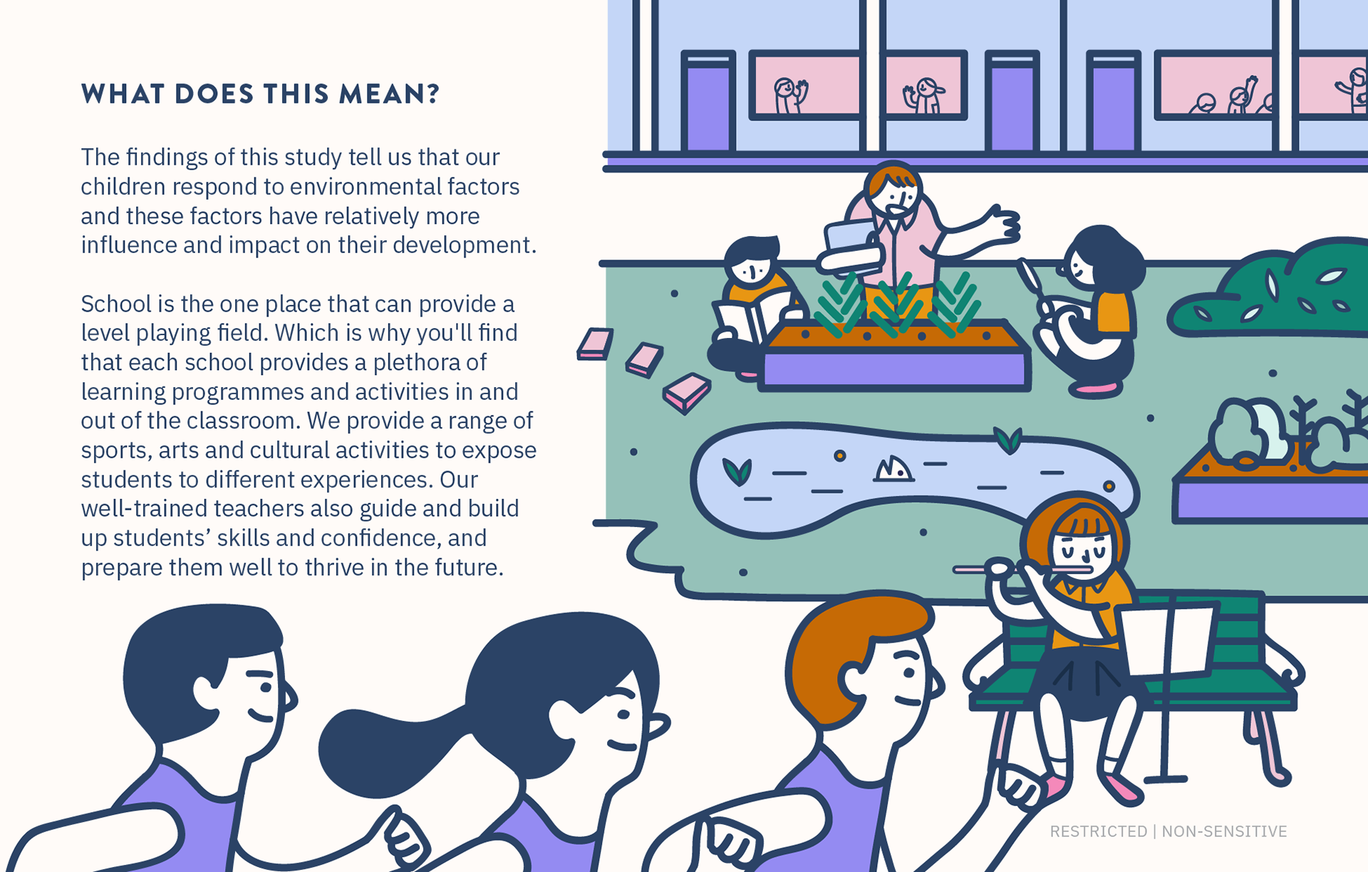
Nature vs Nurture
What influences a child’s grades more – their genes or their environment? This study conducted by MOE explores just that. Design Office helped to convey the study in the form of a statistical story, using data visualisations and illustrations to help readers understand complex data.

---------------------------------------------------------------------------------------------------------------------------------------

School Accessibility via Public Transport
In this statistical story, we used two models to look at school accessibility from the student’s perspective as well as the location of the school. We did this through an interactive presentation that follows the storyline of two characters. The data presented in the story could provide further insights on the current level of school accessibility using the two models.
(For the best viewing experience of this interactive statistical story, please use the navigation arrows on the bottom of each page or click on the images as instructed.)


---------------------------------------------------------------------------------------------------------------------------------------

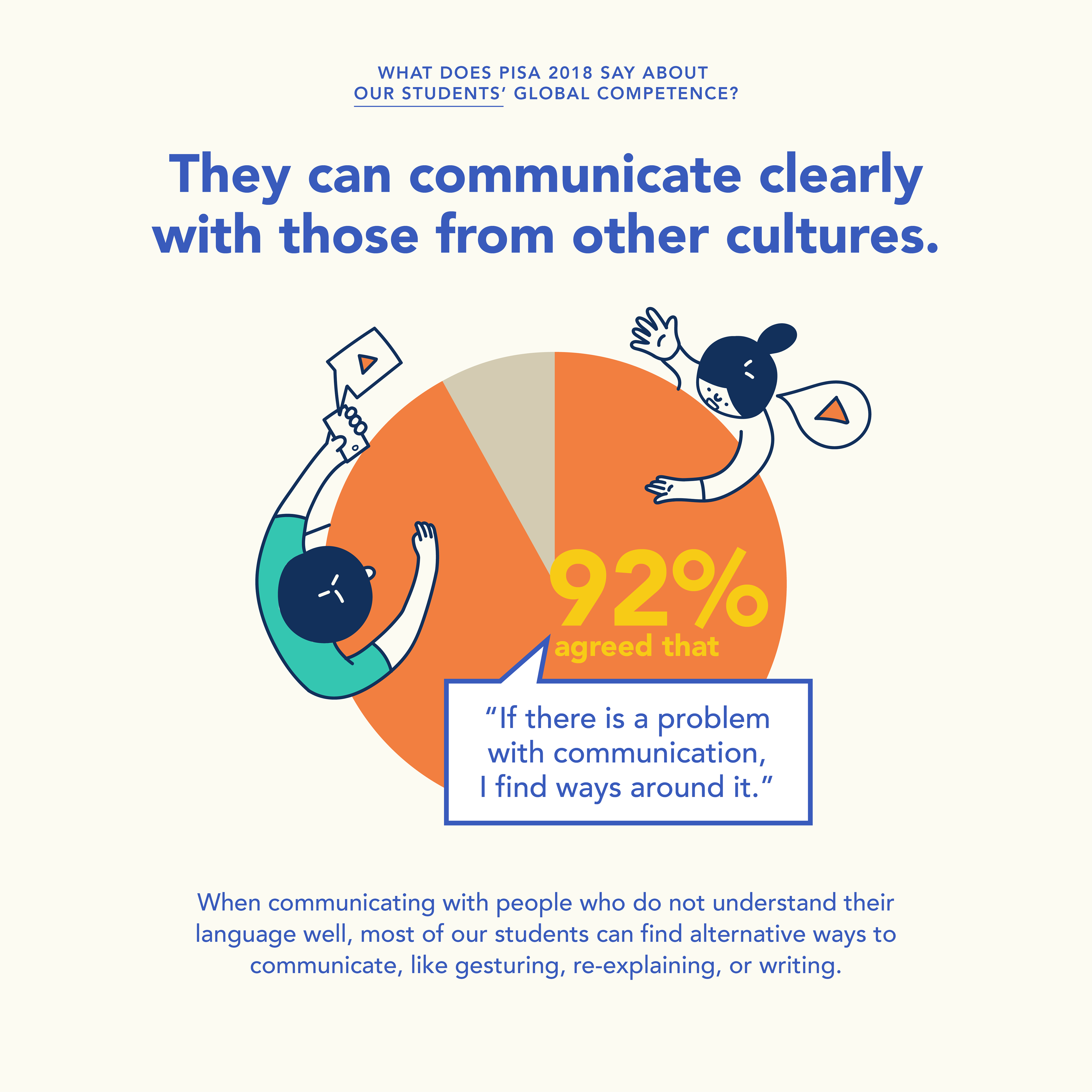
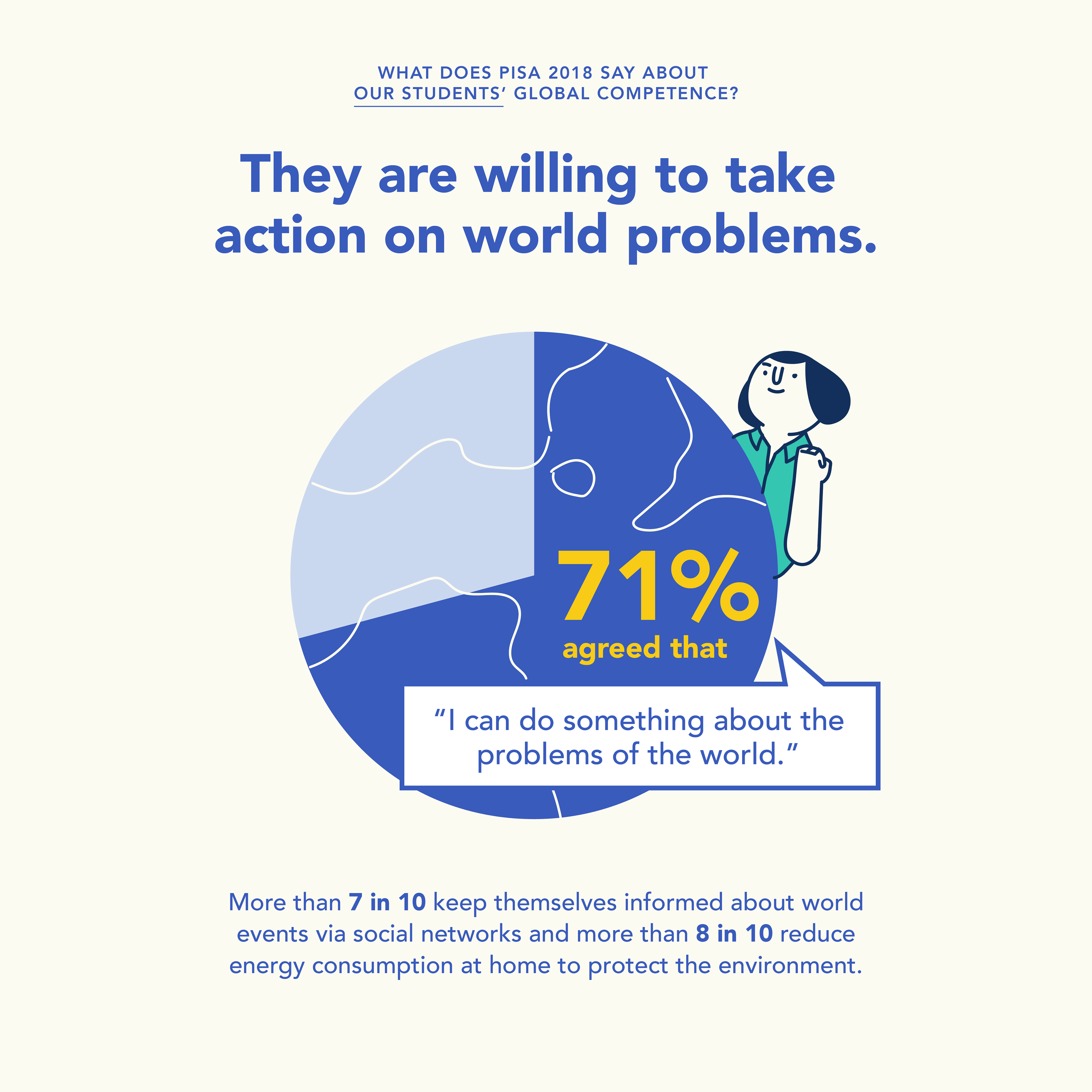
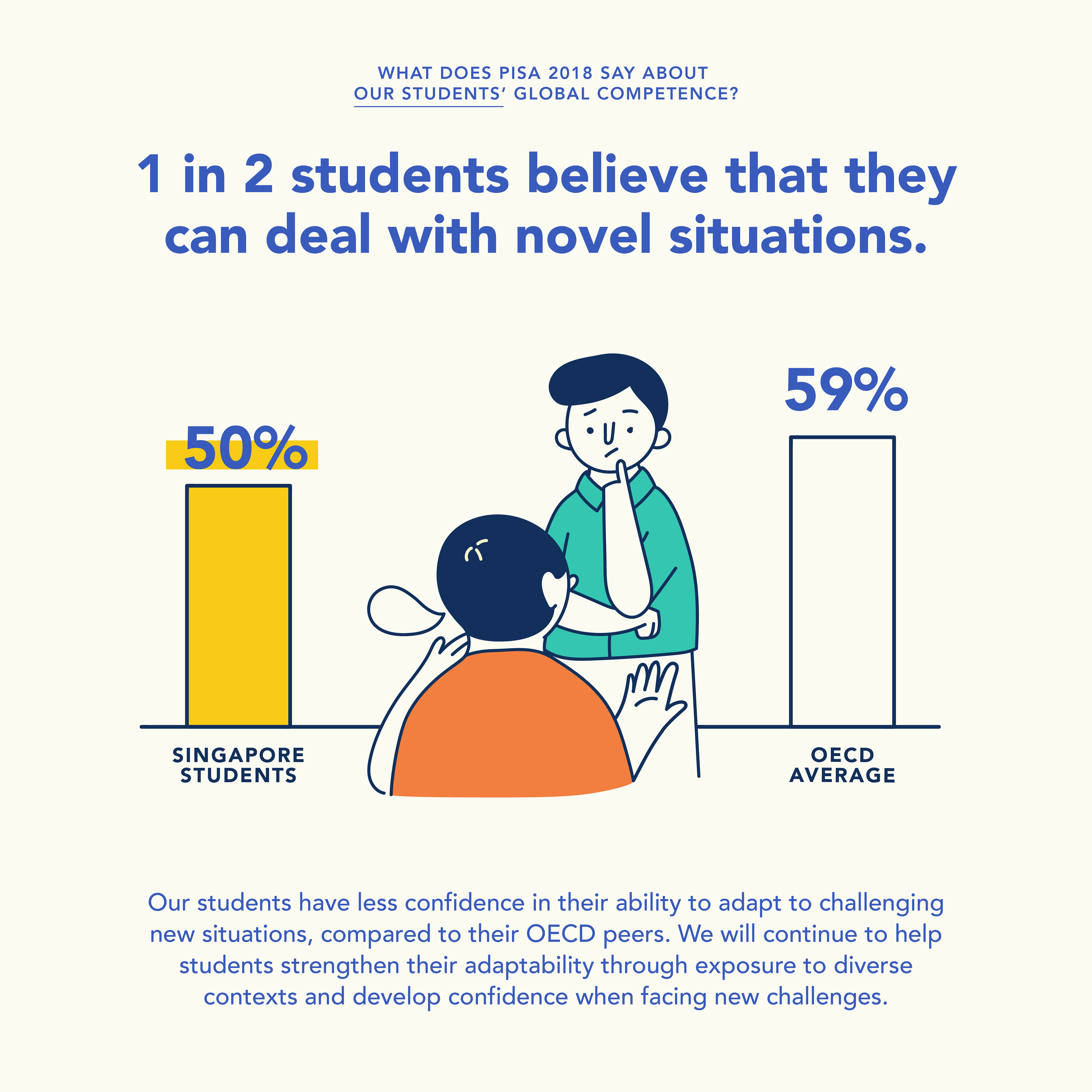
PISA 2018
In this statistical story, we used two models to look at school accessibility from the student’s perspective as well as the location of the school. We did this through an interactive presentation that follows the storyline of two characters. The data presented in the story could provide further insights on the current level of school accessibility using the two models.
(For the best viewing experience of this interactive statistical story, please use the navigation arrows on the bottom of each page or click on the images as instructed.)


---------------------------------------------------------------------------------------------------------------------------------------

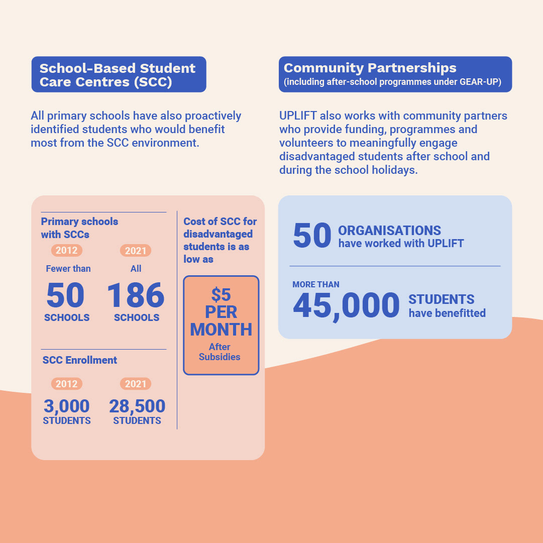
UPLIFTing Our Students explainers
Making sense with numbers!
Complex policies can be dry and usually require lots of explanations to get the point across. How can we do so with numbers and graphics instead?
We created an infographic that uses existing supplementary data to emphasise the expansion of the UPLIFT initiative in different areas with a focus on numbers to tell the story!
Our approach was to keep things eye-catching yet simple and informative. The UPLIFT infographic’s objective was to enable the media