Making sense with numbers
Complex policies can be dry and usually require lots of explanations to get the point across. How can we do so with numbers and graphics instead?
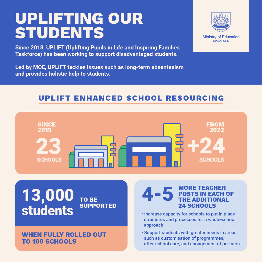
We created an infographic that uses existing supplementary data to emphasise the expansion of the UPLIFT initiative in different areas with a focus on numbers to tell the story.
Our approach was to keep things eye-catching yet simple and informative. The UPLIFT infographic’s objective was to enable the media to quickly grab the key messages. A true example of how sometimes ‘less can be more’.